Event monitoring platform
RMA - Visual Website Redesign

Rave Me Away (RMA) is an enterprise B2B SaaS crowd safety and event management platform designed to optimize real-time operations at large-scale music festivals and venues. The software unifies complex backend event telemetry with dispatch communication, enabling operations leads to manage crowd densities, track field guards, and mitigate safety hazards seamlessly.
Timeline
6 weeks (Iterative Web Redesign Phase).
Responsibility
Lead Product & Web Designer. I owned the web re-platforming, conversion optimization strategy, corporate branding alignment, and landing page product positioning.
Goal
Redesign and implement a high-conversion marketing site on Framer that commands enterprise authority and translates complex backend SaaS telemetry into clear, high-value value propositions for festival founders.
While the Rave Me Away SaaS technology was highly robust, the original web presence failed to reflect that sophistication. The landing page lacked a cohesive structure, relied on weak visual hierarchy.
The Stigma
Founders and security executives associate crowd safety with absolute liability and compliance. A chaotic, overly stylized website undermined product trust before a demo could even be booked.
Information Overload
Complex background operations (such as real-time coordinate tracking and dispatcher loops) were explained via dense blocks of text rather than scannable, outcome-oriented layout modules.
Conversion Drop-offs
Prospective B2B buyers looking for immediate operational deployment could not quickly locate deployment parameters or feature capabilities, resulting in poor inbound lead generation.

The redesign required an aesthetic strategy that felt advanced enough to handle real-time AI clustering, yet disciplined enough to satisfy corporate risk assessment teams.
Competitor Benchmarking
I analyzed prominent B2B emergency dispatch utilities, modern logistics software, and high-tier SaaS marketing pages.
The Insight: Leading platforms establish credibility by keeping decorative accents minimal, anchoring layouts with geometric grids, and making product dashboards the core hero elements.
Design Philosophy Alignment
I established a Clean Cyberpunk aesthetic matrix. This aesthetic uses dark mode foundations to reference real-time night operations, high-tech interface grids to signal precision, and sharp typography to maximize scannability under a cohesive title casing rule.

My design process involved shifting the platform from an abstract concept into a bulletproof, production-ready enterprise console.
Decision 1: The "Hero Dashboard" Reveal
Legacy Site
The hero area relied on abstract festival imagery that failed to show what the software actually did, leaving users confused about whether the app was for attendees or organizers.
The Redesign
I replaced the imagery with a high-fidelity, crisp mockup of the actual Real-Time Dispatch Console nested directly inside a premium browser frame.
The Rationale
Dispatchers successfully reduced active map clutter by 60%, drastically accelerating the selection speed of targeted responders.
Decision 2: Transitioning to Structural Bento Grid Layouts
Legacy Site
Features were listed in standard alternating text/image rows, which felt generic, inflated page length, and caused reading fatigue.
The Redesign
I engineered a modular Bento Box Layout system to break down core features (such as Real-Time Guard Tracking, Live Heatmaps, and Zone Telemetry) into structured, variable-width cards.
The Rationale
The bento layout reflects a data-dashboard environment. It lets me present multiple high-signal product vectors cleanly within a single viewport, instantly separating the company from low-tier or student portfolio styles.
Decision 3: Eliminating All-Caps Headers for Universal Readability
Legacy Site
Section headers and component labels utilized intense all-caps styling, creating an aggressive, cluttered visual tone that eroded readability.
The Redesign
I strictly enforced proper Title Casing across all website headers, cards, and section titles, maintaining strict spacing buffers between typography blocks.
The Rationale
Title casing calms the interface tone, brings a corporate and authoritative polish to the narrative, and aligns the brand with enterprise software conventions.
The finalized website acts as a high-conversion, enterprise-grade portal meticulously built on Framer to convert high-value leads.
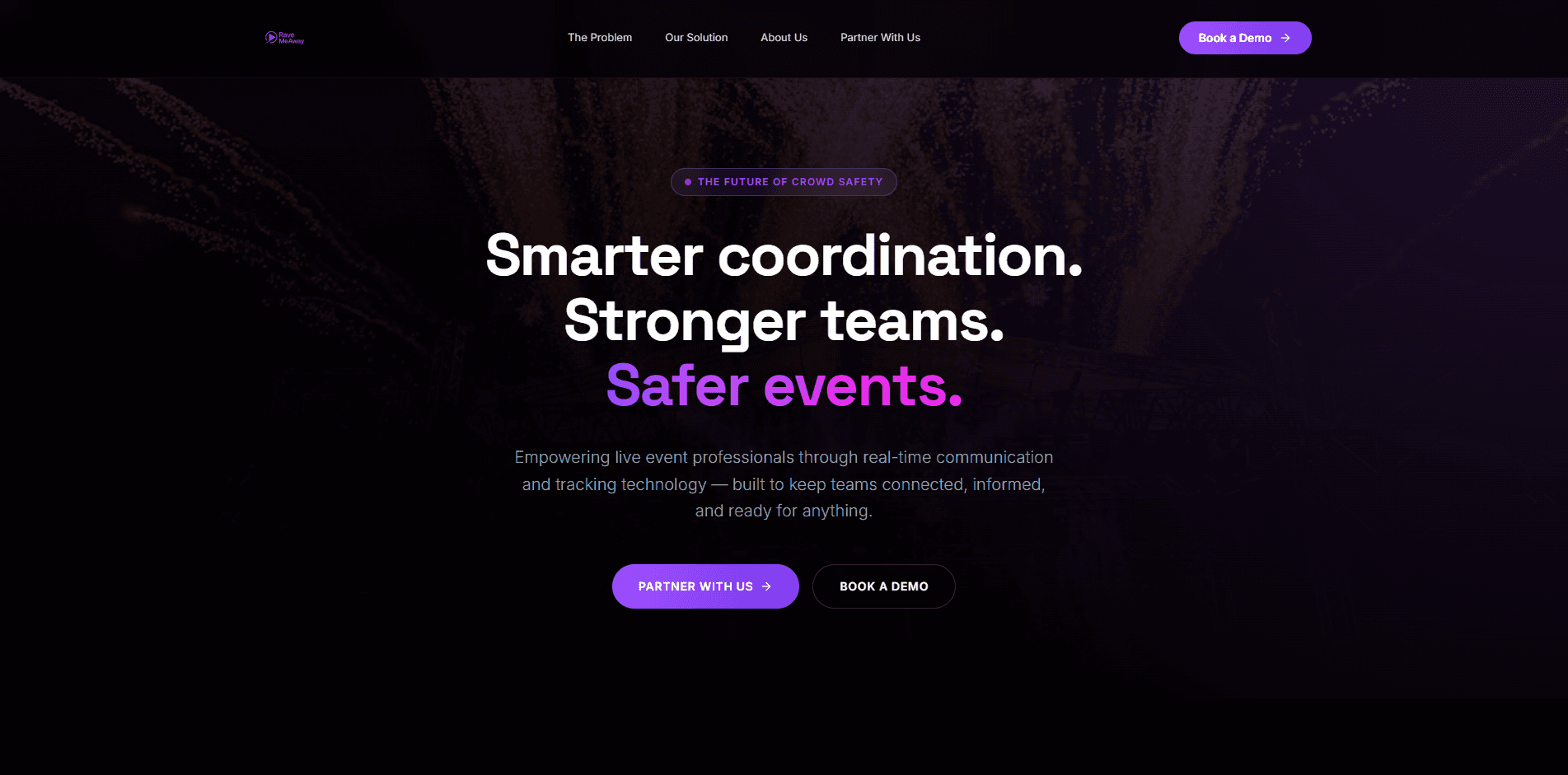
The High-Impact Landing Page
A structured, bento-driven layout that instantly balances technical operation specs with polished brand presentation.
Interactive Product Teasers
Micro-interactions built into feature cards that demonstrate how guards are tracked effortlessly across designated zones.
Authoritative Typography & Contrast
A high-contrast dark palette balanced by flawless title casing and precise spacing to maximize readability for corporate buyers.


The comprehensive web overhaul completely realigned Rave Me Away’s market presence with its actual enterprise capabilities.
SaaS Validation
Shifting the visual narrative from "festival lifestyle" to a "data-driven console" completely removed the conceptual stigma, instantly positioning the software as production-ready.
Framer Implementation Success
Designing and launching directly on Framer ensured perfect responsive parity across desktop and mobile, giving sales teams a high-performance asset to pitch directly to safety founders.
Product-Thinking Proof
The web redesign demonstrates a clear ability to handle complex system mechanics, translating high-stress guard operations into clean, intuitive, and conversion-optimized layout architectures.